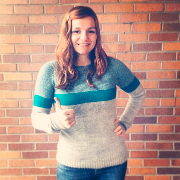
I have the honor of knowing many talented women from my college years at Moore College of Art & Design, and one creative friend in particular has been rocking it lately - Dom Streater is a Fashion Designer, the winner of the 12th season of Project Runway, and a generally awesome person. Needless to say, I was extremely excited when she asked me to work on her brand as a fashion designer.
STEP 1: CREATIVE BRIEF
To get things started, I worked with Dom to put together a creative brief. This involves a series of questions I use to distill exactly what a client wants to communicate with their logo and identity. Creating a design brief is a great way to ensure you and your client are on the same page, even if you’re working with someone creative or who you know well. Through this discussion, Dom and I came to the conclusion that a hand-drawn logo would be a good approach, and would evoke her special blend of traits in her work: retro but modern, feminine but bold.
STEP 2: MOODBOARD
Once we had the blueprint figured out, I started with some image research. Though you may agree conceptually, you and your client may have very different ideas about how those concepts translate visually. A mood board is great step to bring to life what’s you’ve discussed - before you invest time and energy into a particular design direction. This is the inspiration board that I created for Dom’s logo, incorporating some images of her work with some of the patterns and typography styles that I had in mind:
STEP 3: SKETCH, SKETCH, SKETCH!
Once we decided to move ahead with this hand-drawn typography approach, I hit my sketchbook and roughed out as many potential designs as I could. I typically work in a small moleskine notebook first, then bring potential options onto larger paper and refine with tracing paper and markers.
STEP 4: TWEAK, REFINE, & VECTORIZE
I chose three designs that I felt were the strongest, and shared them with Dom.
We decided to combine some of the different elements that we liked in each into one logotype. I did a few more versions in pencil and marker, and then brought it into the computer to vectorize in Adobe Illustrator. This is the final logo:
STEP 5: REAL-LIFE APPLICATIONS
Here it is in action on the business cards I designed, and a trade show sign:
Hand-drawn typography can be a satisfying iterative process - from roughing out the initial concept, to finessing the subtleties of curves in Illustrator. I particularly love using it for identity projects when it’s appropriate, I think it’s a great way to communicate the personality of the individuals behind the brand. And of course, working with talented and creative people like Dom makes it all the more fun!
Do you have a different route in your creative process?
Let me know in the comments!


